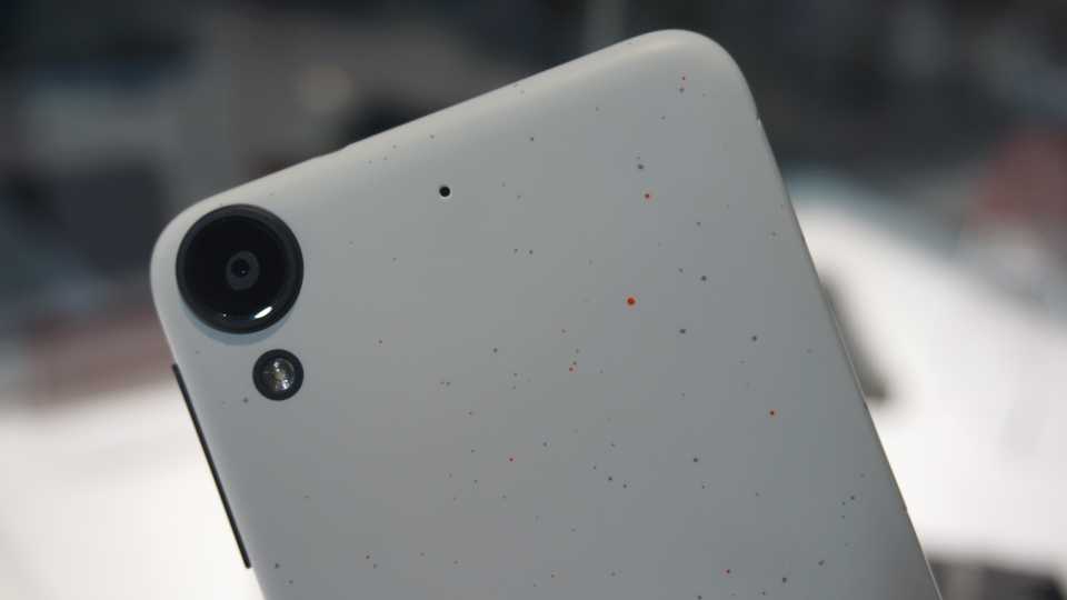
HTC is known for producing stunning smartphones, such as the HTC 10 with its double-chamfered edges and the Desire 820 with its gorgeous dual-colour unibody design. The Desire 530, is HTC's budget smartphone, which has a dotty 'micro splash' finish making it one of the most characterful smartphones available.
In comparison to its budget competitors, the Desire 530 stands out with its unique paint-speckled polycarbonate shell - this comes from HTC's manufacturing process, which applies different colours to the phone's body at varying degrees of pressure and viscosity.
However, there's lots of competition, such as the 3rd Gen Moto G at £160 (previously £130) and the better Moto G4 at £170 - the HTC Desire 530 has

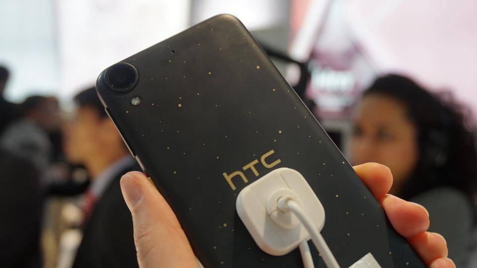
It's certainly a lovely thing to behold, and the grey and gold dot combo I saw at MWC in February 2016 is by far the most eye-catching one of the lot. There's also a white version with a red and blue dot pattern, but these colours didn't stand out nearly as much as the gold dots on the darker model. I do quite like each one's matching coloured, textured power button on the side of the phone, though, as its extra ridges not only look and feel great under your thumb, but it also makes it very easy to find when you run your hand along the edge of the handset.
With such a gorgeous design at its disposal, it seems odd, then, that the Desire 530 is also available in plain old block grey and white models, like the one I was sent for review. I can't see anyone picking these over the micro splash versions, as the way it looks is easily one of the phone's greatest assets.
Andorid 6.0 & Sense 7
The attention to detail in the phone's design also extends to the main interface. HTC's Sense 7, which runs on top of Android 6.0.1 Marshmallow, is one of the best and most customisable Android UIs currently available. With its Theme Generator, you can tweak and adjust every aspect of your phone's appearance, from the font right down to individual app icons.
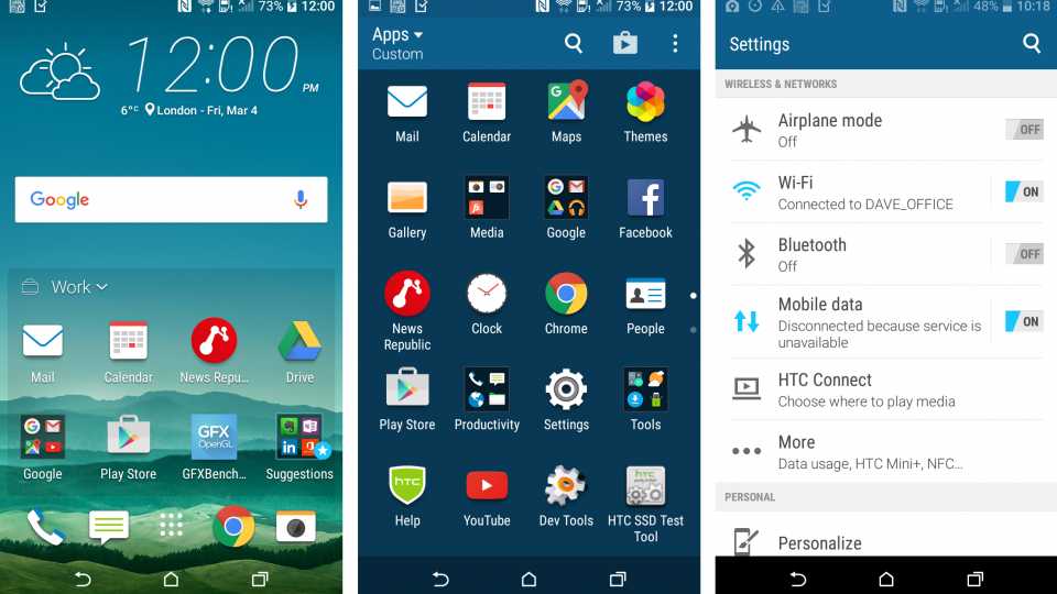
^ HTC's Sense 7 interface is excellent, and its Sense Home box on the main home screen helps promote useful apps depending on your location
There are several ready-made themes available to download for free (including my favourite 'Origami' theme, below) from HTC's Theme Store, but you can also create your own themes using photos in your Gallery. Here, the Theme Generator will analyse the colours present in the picture and give you a wide range of shades and accents to pick from, which you can then fine-tune to your liking. It works brilliantly, and the sheer amount of personalisation on offer has yet to be beaten.
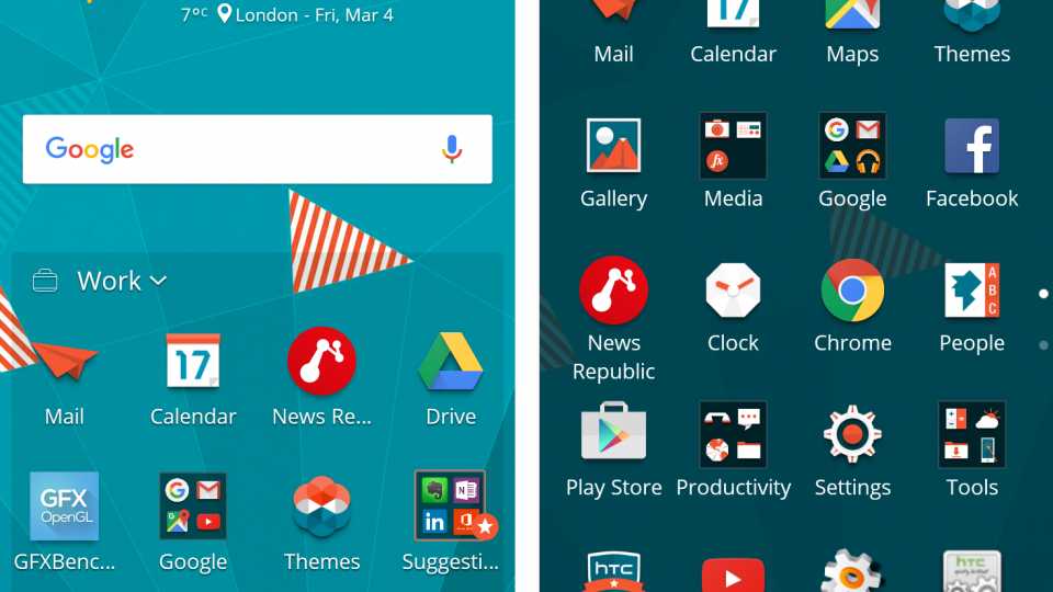
^ Sense 7 is very customisable, and the Origami home theme is one of my favourites
There's also Sense Home, which automatically rejigs the apps on your main home screen depending on whether you're at home, work or on the move. By learning which apps you use most often in which locations, the aim is to make sure all your favourite apps are front and centre when you need them most, so you don't have to dive into the app tray or scroll through several home screens to find them. At Home, for instance, it might prioritise YouTube and entertainment apps, while at work it will swap these out for apps like Google Drive and Mail instead. It takes some time for it to get it completely right, but it certainly helps to cuts down on the amount of home screen clutter on show.

